Titles and their connotations
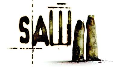
The title and the font used is a very important decision as different selections may have different connotations. Taking this in to mind we have had to design a title that is related to our genre and sub genre which is a horror slasher film.There are many examples of films that have produced excellent titles that are suited to their sub genre and have connotations related to the film. A very good example of this being Saw 2 as they have incorporated the gore sub genre into the title by using fonts and content in the text which have connotations that may be related to this.
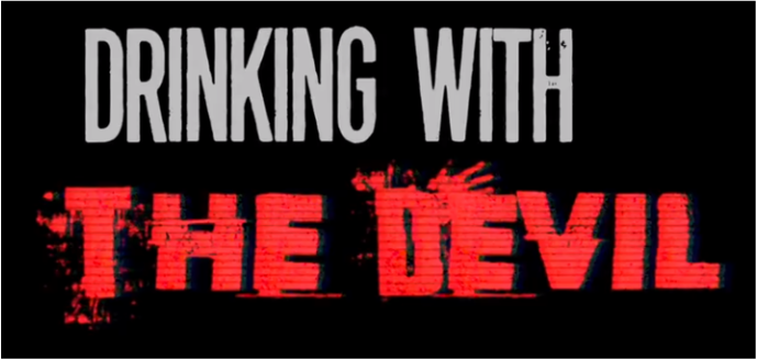
When designing the fonts the group has to make sure it looks professional, in that it is easy to read and it looks like what may be used by a professional film company, and that it is relatable to our sub genre. In order to find the best design we have produced a number of titles which may meet the criteria and we have asked for feedback to aid us in creating the best title we can. Below are examples of the designs that we have used to get feedback on. With the feedback we get we can determine what fonts and colours would be best suited to use to match our film name as we will find people's connotations of our choices therefore which one will look the best.
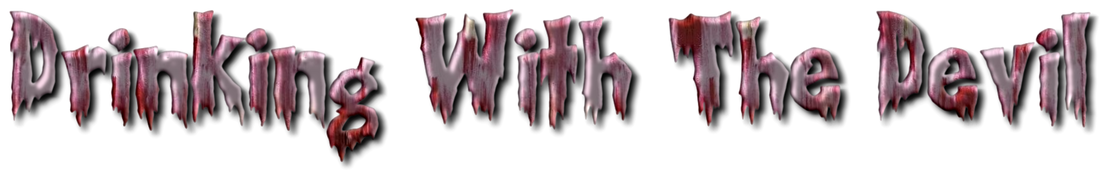
The feedback our participants gave when shown this text was that although the design of the text was accurate the style of the font seemed more suited to the zombie sub genre therefore would not be suitable for our slasher sub genre.

We found that with this title although they thought it looked professional as it was easy to read and quite a simple design, they saw it not appropriate for a horror title as there were no connotations of fear from the font.However they also agreed that the content of the title (the colours and patterns) were appropriate for our sub genre.

This title was seen as our least appropriate title as they not only argued that the font was not appropriate to a horror theme but the content of it did was not very clear therefore did not look particularly professional and may not have been a good style to use for our title.

This title was seen as an appropriate font for a horror movie however when asked if it suited our sub genre of a slasher film, our feedback suggested that it was more suited to an apocalyptic type sub genre therefore would not be a good style to use for our text.
Taking this feedback as advice we decided to take the positive remarks made on some of the titles to try and make one which may suit all needs therefore through this we can potentially make an ideal title that goes with the horror genre and the slasher sub genre. Because of this we have decided to use this font as we believe it is the most appropriate for our film: