Distribution company (international pictures)
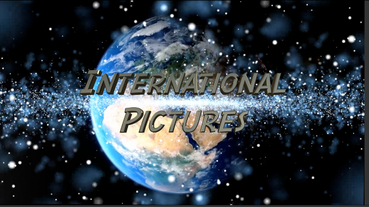
This distribution company clip is for our opening title sequence to give across a professional appearance as all successful films have a distribution company to promote it. This is why we chose a global design as it puts across the idea that the distribution company is worldwide so could show the film in many places. We were going to choose a font style called comic script as shown below however it looked unprofessional therefore we changed it to copperplate gothic bold. Finally we have used the name International Pictures as it shows again that the company is global and that it can display the opening sequence to a large audience.
We have also used three different layers. The first layer was the globe spinning which again emphasises that the company is worldwide. The second two layers are the stars/ nebula flying forwards which gives the effect of it being a galaxy. We used the first layer of the nebula however it did not cover enough of the screen therefore we used another layer of this and flipped it so that it was coming out across all of the screen.
The design of our distribution company clip has been heavily influenced by other distribution companies as we have take inspiration from the designs of them as well as the audio they have used.
Universal is an extremely successful distribution company having distributed films such as Jurassic World, Fast and Furious and Jaws.The distribution company that we have used as inspiration for the visual design of our distribution company is the Universal Pictures clip as they have used a globe to indicate that the company is worldwide. An example of a horror film that has chosen to go through Universal Pictures for the distribution of their film is Dracula.This makes a film company want to invest in our distribution company as it gives the biggest possibility of their film being successful. In the clip below you can see the similarity in the designs:
We have also used inspiration from the Columbia Pictures distribution company intro as we have used the same type of music. This is the music with the increasing music until the name of the distribution company is revealed. Columbia Pictures has distributed many well known films including Spiderman, James Bond and Ghostbusters. An example of a horror film that has used Columbia Pictures as their distributors is Cabin in the Woods.
